Interior Design vs Interior Decorating

For many looking to change things up around their home, it can be a bit difficult to know where to start. While it’s one thing to simply do some cleaning and reorganizing, things get tricky when getting a professional involved. Depending on who you go with, they may refer to themselves as an interior decorator or as an interior designer.

Is there a difference between the two; and if so, which do you need for your specific project?

A common misconception for many is the belief that “Interior Design” and “Interior Decoration” are one and the same. In reality, while there is certainly some overlap between the two, the titles are not interchangeable. As we get into each of the two, you’ll learn how to distinguish between the two and when to use the services of one over the other when making plans for your home or other interior location.

Interior Design (Thiết kế nội thất)

  • JOB DESCRIPTION: When it comes to Interior Designers, they are primarily used for spatial plannings and designing and renovating an interior. This includes drawing the initial floor plans as well as adding any decorative accents to the location. They work alongside contractors and architects with the location to best suit the needs of their clients.
  • SCHOOLING: When it comes to the difference between the two, it’s important to know the difference in their level of professionalism. For those labeled as an Interior Designer, the important factor that distinguishes it from decorators is that they require specific schooling as well as formal training. Their work usually involves studying different colors and fabrics, space planning, furniture design, architecture, various drawings, as well as computer-aided design (CAD) training. When graduating, designers will often initially apprentice under an established designer before starting their own enterprise.
  • CREDENTIALS: To become a professional designer in many states, they are required to pass an exam as well as register with a governing council in their country or state. As this is largely dependent on a particular location, these credentials may not be required in every area. As such, it is important to research the local credential requirements in your area before starting your search.

Interior Decorating

  • JOB DESCRIPTION: Whereas Interior Designers work alongside the architects when establishing the overall setup of the area, an Interior Decorator arrives after the area has been completed and, instead, focuses primarily on the visual look of the particular space. The job of a decorator is to bring in different color schemes, accessories, or furniture to an interior and to make it visually appealing. They work with furniture makers and upholsterers as well as homeowners and business managers when decorating a location.
  • SCHOOLING: Compared to Interior Designers, which are required to go through schooling and training, Interior Decorators do not need any particular training or schooling. This is because they are primarily focused on the interior aesthetics as opposed to the overall structural or spatial planning of an area. While many may have a degree in a related field, it is not required.
  • CREDENTIALS: While no schooling is required to be regarded as an Interior Decorator, there are numerous programs and courses available for those interested. These courses emphasize a focus on fabrics, colors, furniture styles, and room layouts. There are organizations such as the Certified Interior Decorators International (CID) that offer certifications to help authenticate and substantiate a particular practice.

Which Should I Hire?

Well, this largely depends on what you need done.

For structural changes (such as wall removal, interior wiring, adding new windows, plumbing, etc) it is important to get an Interior Designer. They can help with planning these changes while working directly with builders and architects.

For largely decorative aesthetic work (wallpaper, furniture style, lighting accessories, etc) getting an Interior Decorator is probably your best bet. Getting an experienced decorator is great for having a place that “flows” well together. These individuals are best at transforming a set room based on a client’s needs and desires and is most often the choice for the vast majority of interior projects.

In the end, however, it largely depends on the skill of the professional. Many designers spend most of their time working on decorating as this is what the vast majority of projects need. Similarly, there are a number of professional decorators that have, through enough experience, learned to work with contractors and builders to most effectively appeal to their client’s needs.

Before hiring either, it’s important to know what you are looking for. After knowing this, find a good professional with a proven reputation. While it is true that designers are for Thi công nội thất structural execution and decorators are for final touches, don’t be afraid to cross lines if one is more reputable than the other.
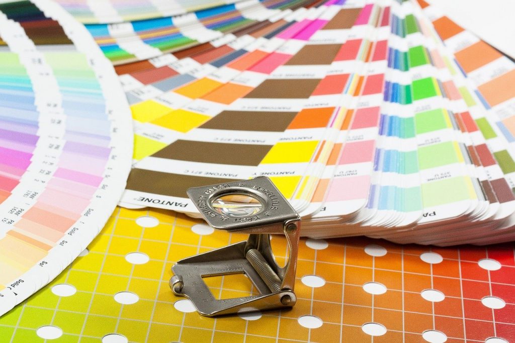
Beginning Graphic Design: Color

It plays a vital role in design and in everyday life It can attract your eye to a specific image Or evoke a certain mood or feeling in yourself And even to communicate important information without using words at all So, how do we know which colors are appropriate for each other, and which are not appropriate for each other? The answer is simple: color theory Artists and designers have followed color theory for centuries However, anyone can know more about it It can make you confident in many different situations Whether you are choosing colors for a design … Or choose the colors of clothes to buy All it takes is a little bit of insight, after which you will look at colors in a completely different way Let’s start from the beginning, from scratch by reminding you of the basics Remember what you learned in school about primary and secondary colors? So you really do have some information on color theory Red and yellow make up orange, yellow and blue make green, blue and red make violet If we mix these colors together, we get a greater number of hues, like orange red, and lemon yellow All together, they form what is known as the “color wheel”.

(From the picture, you may have known why it was called by this name) Now, let’s go a little deeper and learn some of the terms: hue, saturation and value You may not have used these terms in everyday life before, but they are the key to a more understanding of the single color tones Like all of these cards in the home wall paint stores (Dye) is the easiest of these terms to understand, it is just another word for (color) As for (saturation), it means (density), that is, whether the color is dull, bright or bright As for (value), it is due to the color being dark or light Gradually from black to white As you can see, this gives us many different shades of color From dark reddish brown to light pink pastel So, how do we put all this together to create professional-looking color schemes? There are already real, proven formulas that rely on something called “color harmony” and they can help you All you need is the color wheel The easiest formula to achieve harmony is monochromatic, because it uses only one color (or so-called dye) Just pick a color from the color wheel, and use your pre-saturation and value knowledge to create different shades The best thing about monochrome systems is that they are guaranteed harmony The Color Match system uses consecutive colors on the color wheel Such as shades of red and orange, or cooler colors, such as shades of blue and green Be comfortable and manipulate as you like and create for yourself a unique style These equations are just the beginnings for you to inspire you to start after (Complementary colors) are those that are opposite each other on the color wheel, such as, blue and orange Or classic red and green To avoid seemingly simple complementary colors, diversify them by using other shades that are dark, light, or faded The “Complementary Split Color” system uses colors that are on either side of the complementary color of the color that you choose This gives you the same level of difference and clarity, but gives you more colors to use Hence, you will find more impressive results (Tri-color) system uses three colors evenly spaced on the color wheel, taking the shape of an equilateral triangle These combinations tend to be striking, especially when they are with primary or secondary colors Therefore, be careful when using it in your work Quad-color systems on the wheel use a complementary pair of colors, not just one This formula works best if you let one color dominate the design, and the others are marginalized There are a few disliked and desirable things when it comes to color For example, have you ever seen colors that appear to vibrate if you accompany each other? The solution, is to soften those colors (literally), and there’s a simple way to do that Start with one color, and try to set, lighten, darken, or fade Sometimes, a little contrast is all you need for your color palette Readability is an important factor in any design Your color should be easy to read, comfortable to the eye Sometimes this may mean that no color is used at all, or at least not in every small detail Neutral colors such as black, white, and gray can help you balance your design And when you use the colors, they will look unique Each color delivers a message (to whom it is seen) It is important to consider the nature of your project, and then choose the right colors For example, bright colors tend to be fun or contemporary The faded colors seem to be related to work matters, etc.

Sometimes, depending on the context, these colors are amazing in their flexibility You can find ideas for color schemes in all kinds of interesting places Starting with advertising and marketing Even famous artwork You can use the Internet to browse different color schemes, or to generate your own Even experienced designers take inspiration from the world around them There is nothing wrong with finding what you like, then making it your own Everywhere you look, there are colors, colors, and more colors It may be suspicious if you use it in your business, but it is not supposed to be Just keep experimenting, and don’t forget what you learned about color theory Soon, choosing the cool colors will be your second nature We hope you enjoyed learning the basic information about color Take a look at the rest of our design syllables, including: Art of Writing, Pictures, and Composition